Les belles affiches > Round-up artwork > Captain America
Captain America: The First Avenger
Joe "Jumanji" Johnston, 2011Article available in french here
 © Paramount Pictures
Captain Jehovah
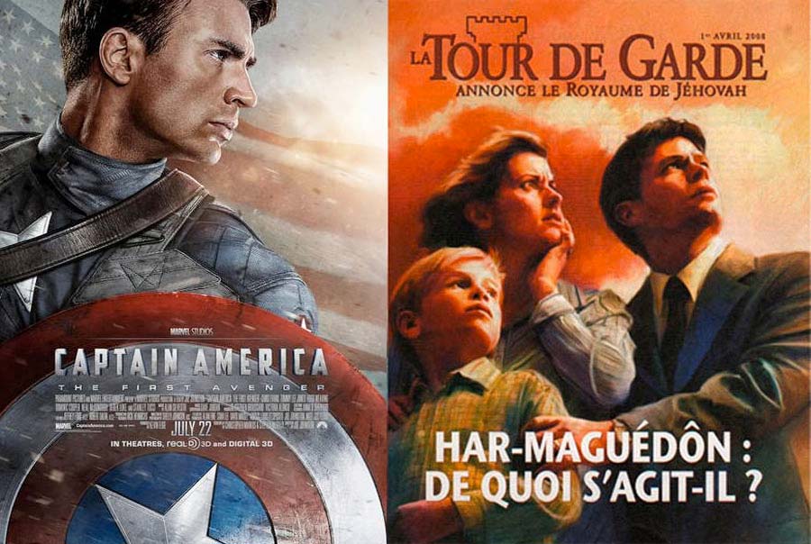
Trailer Good ol' Captain American could have passed as a case study but its graphical treatment alone deserves a detailed analysis. I like the Captain America posters. Their comic book aspect glorifying Uncle Sam, and the timeless All American Hero. You’d think you’re in the middle of Cold War what with all the pro-Washington propaganda. Not really surprising in a way, as the cartoons first sprang from Jack Kirby and Joe Simon’s sharpened pencils in December 1940 as a reaction to Nazi tyranny which the United States would move against a few years later. The message that comes across is very (or almost too) basic. Developed in the style of a political campaign poster, ideogramming the title in the Japanese version adds an extra kick. To get a 3D effect, Photoshop CC now has a 3D + Extrude menu, which is widely used by poster designers worldwide. To that, you can add textural effects like noise, metal overlay, motion blur, contours, etc. Technique Our poster has three levels of composition. The American Flag in the background, Captain "Chris Evans" America, and the famous vibranium shield in the forefront. A textured mix of fire/metal/rust, sprinkled on in blending mode and other Gaussian filters, cover the plate. The idea is to evoke heavy duty armor, world war. But the most interesting aspect is the graphic work on the hero. To accentuate dramatic facial depth, Polish photographer Andzrej Dragan invented a new technique based on strong contrasts and clean features. In fact he created a series of magnificent portraits, the most famous one of which being that of American filmmaker David Lynch. This can be achieved in Photoshop in several different ways but the key ingredients are invariably layers, curves, Silver Efex Pro filters (highly recommended but not indispensable), high pass, overlay, unsharp mask, line burn, etc. Eventually, the outcome will resemble more or less this particular poster. You can also enhance with light/dark brush, then change blending mode for finetuning. Artwork Let’s just say that the striking resemblance between our two graphics lead to a number of questions. Yes, we are in 1940s propaganda mode, with the danger of socialists, and then communists looming on the horizon. The end of the world maybe ? Whatever inspired Jehovah’s Witnesses has clearly done a number on Marvel the designer. At least we hope it was this way, not the other way round. The Home Ministry is on it. We will keep you posted.
The alternative
 © Paramount Pictures
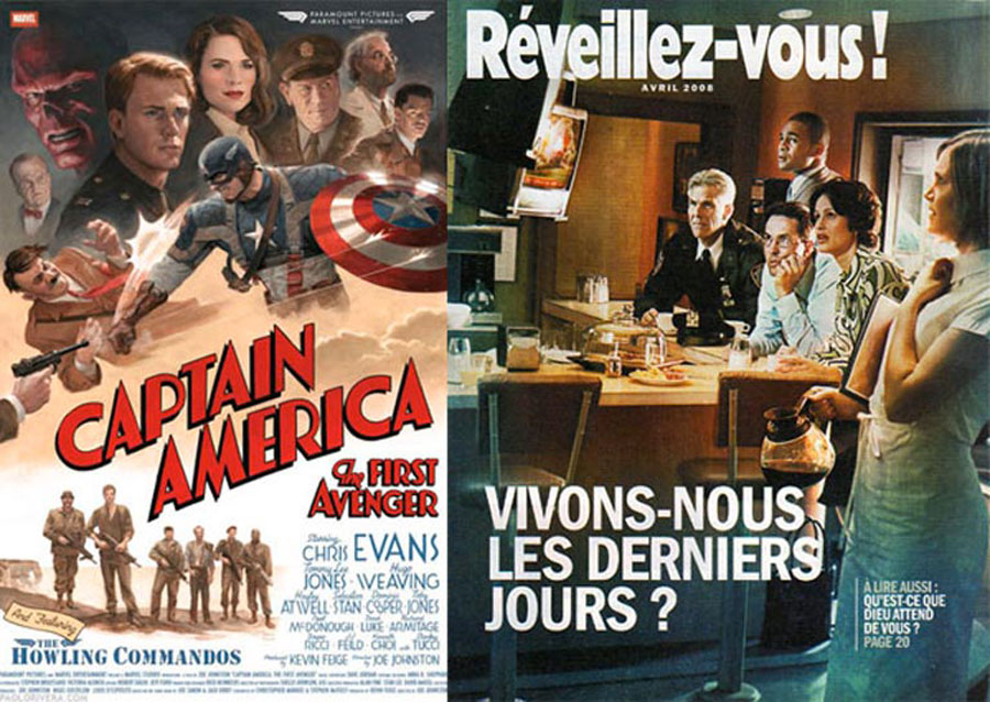
Below is a very original variation, handdrawn and graphically completely different, and also styled in that unique and special propaganda spirit of the 1940s. You serenely watch as our hero Captain America whacks Hitler who has been asking for it, bullets ricocheting off his shield, a collage of the protagonists’ images looking toward the future, the billing block with its retro typeface, the title in dynamic diagonal which draws attention to the movement and the command of the elite unit at the bottom. And all of that from a low angle perspective. Nowadays, posters are hardly handdrawn anymore as the designer geek has gradually replaced the lonesome illustrator. Be that as it may, those among us who pay real close attention may have picked up that the Jehovah’s Witnesses’ posters uncannily resemble the retro-classo-parano-coco-nazillo-militaro-roswello aspect of the 1940s and 50s. They are still drawn by hand, illustrated, painted, and designed like in the good old days of the metal chicory coffee ad plaques in granny’s attic. The light source comes from above, eyes unmistakably turned upward to it, conveying fear and confidence in equal measure. A connection can therefore be found between the style and the content of our two posters. Forced brightness and texture convey a message of hope. The « handdrawn » aspect creates a direct emotional bond with the onlooker. That’s graphically brilliant but for the sake of your mental wellbeing and mine, this is where this analysis should end.
